Yield Curve Inversion: What It Signals About Recessions
A yield curve inversion sounds like obscure bond market jargon. It’s actually one of the most closely watched recession warning signs in modern finance. History gives it a genuinely impressive track record, even though it isn’t perfect.
What a Normal Yield Curve Looks Like
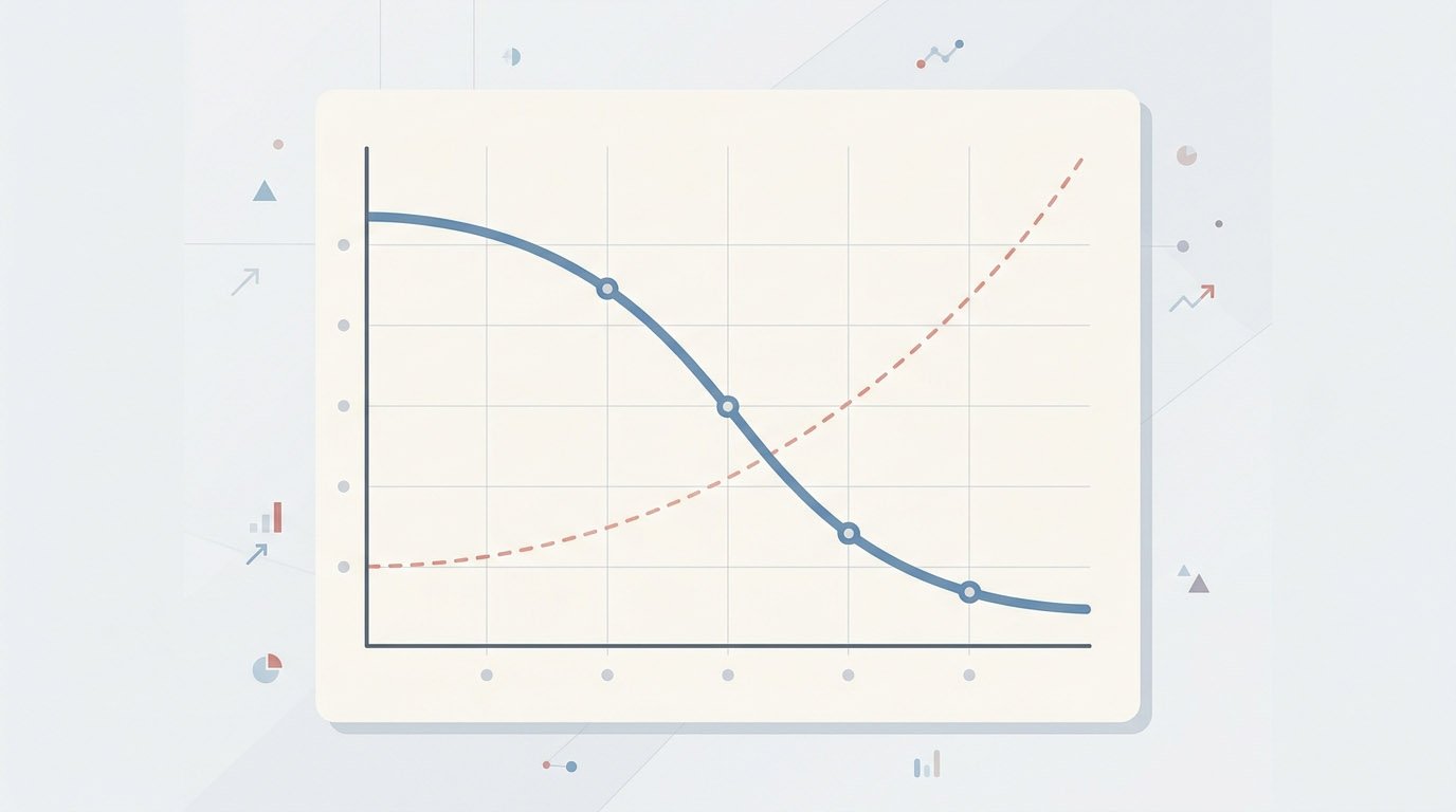
A yield curve plots the interest rates of government bonds against how long until they mature. Under normal conditions, longer-term bonds pay higher yields than shorter-term ones. A 10-year Treasury bond typically pays more than a 3-month Treasury bill. This makes intuitive sense. Lending your money for a decade carries more risk and uncertainty than lending it for three months. Investors demand a higher return to compensate for that.
Plot these yields across every maturity, from a few months out to 30 years, and you get an upward-sloping curve. Short rates sit low. Long rates sit high. The line climbs steadily as maturity increases. This is what economists call a normal yield curve.
What a Yield Curve Inversion Actually Means
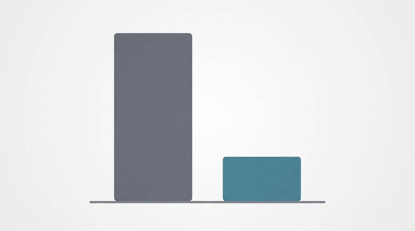
A yield curve inversion happens when that normal relationship flips. Short-term bonds start paying higher yields than long-term ones. A 2-year Treasury note might pay more than a 10-year Treasury bond. That’s the opposite of what typically happens. The curve, instead of sloping upward, tilts downward or flattens out entirely.
This isn’t just a curiosity for bond traders. An inversion means investors expect interest rates to fall in the future, usually because they expect the economy to weaken. That expectation is exactly why an inversion carries so much weight as an economic signal.
Why This Signal Gets So Much Attention
An inverted yield curve has preceded nearly every U.S. recession over the past several decades. This holds true based on data going back to the 1950s. This track record is unusually consistent for an economic indicator. That’s rare in a field where most predictive signals produce a lot of false alarms.
The specific spread most closely watched compares the 10-year Treasury yield against the 2-year Treasury yield. Some economists prefer comparing the 10-year against the 3-month bill instead. Both versions have shown a strong historical relationship with recessions, even though they don’t always invert at exactly the same time.
Why a Yield Curve Inversion Happens Mechanically
Short-term rates are heavily influenced by the Federal Reserve’s current policy stance. Raise the federal funds rate to fight inflation, and short-term Treasury yields tend to rise right along with it. This happens fairly directly and quickly.
Long-term rates work differently. They reflect investor expectations about growth and inflation over many years, not just the current policy setting. Investors might expect the economy to slow down significantly, perhaps because current high rates will eventually choke off growth. They expect the Fed to cut rates in the future. That expectation pulls long-term yields down, even while short-term yields stay elevated from current Fed policy. The gap between the two can flip negative, producing the inversion.
How Much Lead Time This Signal Actually Gives
Historically, a recession has followed an inversion anywhere from several months to roughly two years later. This wide range is part of what makes the signal tricky to use for precise timing. It reliably points toward “a recession is coming.” It doesn’t reliably say exactly when, though.
This lag also means the inversion often reverses. The curve returns to its normal upward slope, before the recession it predicted actually begins. Some analysts watch for this “un-inversion” as an additional signal, since it sometimes lines up closely with the actual start of an economic downturn.
What a Yield Curve Inversion Means for the Stock Market
An inversion doesn’t necessarily crash the stock market immediately. Markets have historically continued rising for months, sometimes over a year, after an inversion first appears, before a downturn eventually arrives. This delay has burned investors who tried to time an exit right at the moment of inversion. They ended up missing out on further gains before any real trouble started.
Our article on bear market vs bull market covers how these market cycles have historically played out. It shows how long downturns tend to last compared to the recoveries that follow them. Our piece on what causes a stock market crash covers the specific triggers that can accompany an economic downturn once one actually begins.
Why the Signal Isn’t Perfect
Not every inversion has led to a recession. The ones that have varied significantly in severity and timing. Structural changes in bond markets, unusual monetary policy periods, and global capital flows can all distort the relationship between short and long rates. This can happen without necessarily signaling the same economic message the indicator historically carried.
Some economists argue that unconventional central bank policies in recent decades have changed how reliably this signal works compared to earlier historical periods. Treat it as one important input among several, rather than a standalone crystal ball that guarantees a specific outcome on a specific timeline.
How Recessions and This Signal Actually Connect
Understanding what a recession actually involves helps put this whole signal in context. Our article on recession vs. depression covers how economists officially define a recession. It also covers how that differs from the much rarer, more severe downturn of a depression. A yield curve inversion is a warning sign pointing toward the more common of these two outcomes, not the rarer, more extreme one.
Interest rate policy itself plays a central role in this whole picture. Our article on how interest rates affect the economy explains the broader mechanism connecting Fed policy, borrowing costs, and economic growth. That’s the same mechanism driving the yield curve dynamics described here.
Tracking This Signal Yourself
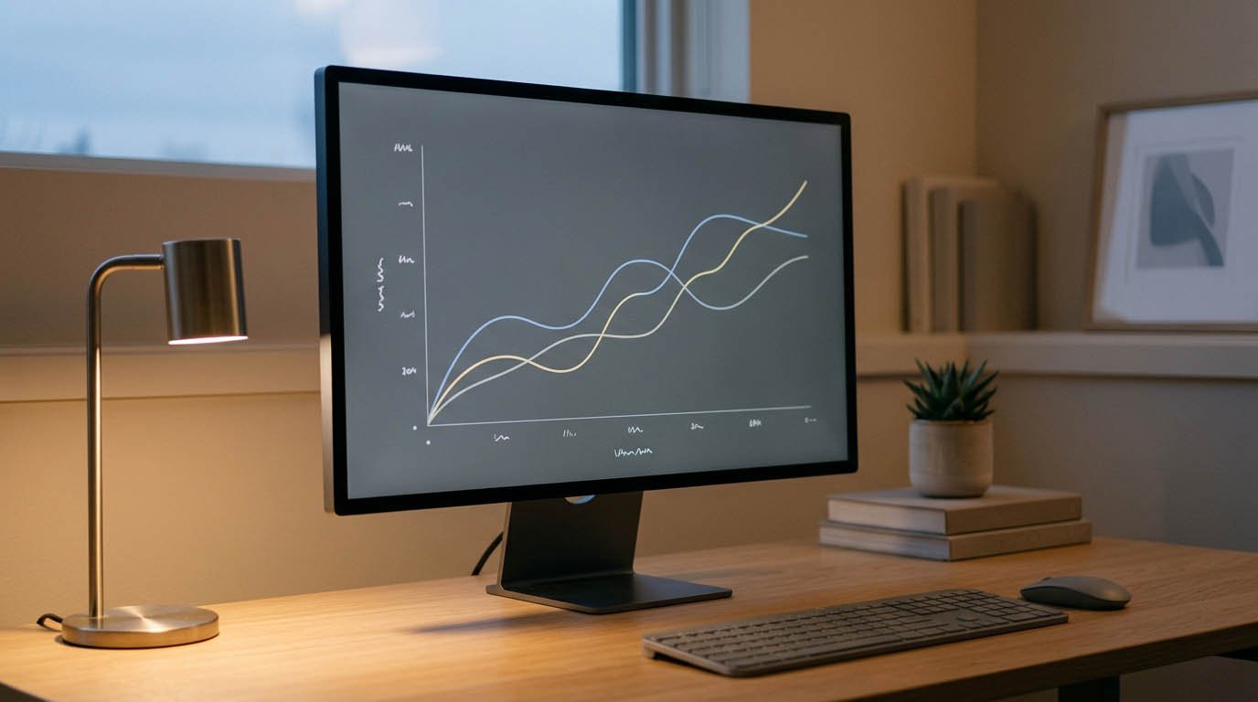
Anyone can check the current state of the yield curve without needing a Bloomberg terminal. Government sources publish daily Treasury yield data for free, covering every maturity from a few weeks out to 30 years. Comparing the 10-year and 2-year figures directly gives you the spread most commonly referenced in financial news.
A positive number means a normal, upward-sloping curve. A negative number means an inversion is currently in effect. Watching this figure over time, rather than checking it once and forgetting about it, gives a better sense of whether the signal is strengthening, weakening, or reversing.
What to Actually Do With This Information
For most long-term investors, an inversion isn’t a signal to panic-sell or dramatically restructure a portfolio overnight. Given the historical lag and the imperfect track record, trying to precisely time an exit and re-entry around this single indicator has proven difficult. Even professional investors with far more resources than an individual saver typically struggle with this.
It’s more useful as a general awareness tool. Think of it as a signal that economic conditions might be shifting, worth watching alongside other data rather than reacting to in isolation. Staying invested through market cycles, rather than attempting to time them around any single indicator, has historically served long-term investors better than the alternative.
Common questions about yield curve inversion
This varies considerably by episode, ranging from a few months to well over a year in some historical cases. There’s no fixed duration, which is part of why the signal is better at indicating direction than precise timing.
Not directly. It reflects investor expectations about future growth and rate cuts, rather than causing the slowdown itself. It’s better understood as a symptom of underlying economic conditions than a direct cause of a downturn.
The 10-year versus 3-month spread is favored by some researchers, including certain Federal Reserve economists, though the 10-year versus 2-year spread also has a strong historical track record and gets cited frequently in financial media.
A few more things worth knowing
Yes, this has happened historically, sometimes called a false positive. It doesn’t happen often, but it’s a real possibility that keeps the signal from being treated as an absolute guarantee.
Yes, many developed economies monitor their own government bond yield curves for similar recession signals, though the specific historical track record and typical lag time can differ from country to country.
Most financial guidance suggests against making major portfolio changes based on a single indicator alone, given the historical difficulty of timing markets precisely around this or any other individual economic signal.